
Google has consistently prioritized enhancing user experience across its platforms, and the introduction of Android Widget Quality Tiers is its latest stride towards excellence. Announced in October, these tiers categorize widgets based on their functionality, aesthetic appeal, and user friendliness, establishing a clear framework for developers aiming to deliver superior widget experiences on Android devices.
Decoding the Widget Quality Tiers
Understanding the Three Tiers
Google’s classification into three quality tiers sets a definitive standard for widget development:
- Tier 3: Low Quality – These widgets fail to meet the basic criteria for layout, color, discovery, and content, offering subpar user experiences.
- Tier 2: Quality Standard – Widgets in this category are helpful and usable, providing a quality experience that meets standard expectations.
- Tier 1: Differentiated – The crème de la crème of widgets, these provide personalized, hero experiences that allow users to create unique and productive home screens.
Criteria for a High-Quality Widget
Google has laid out specific guidelines to help developers elevate their widgets from merely functional to exceptional. Here’s what sets apart the tiers:
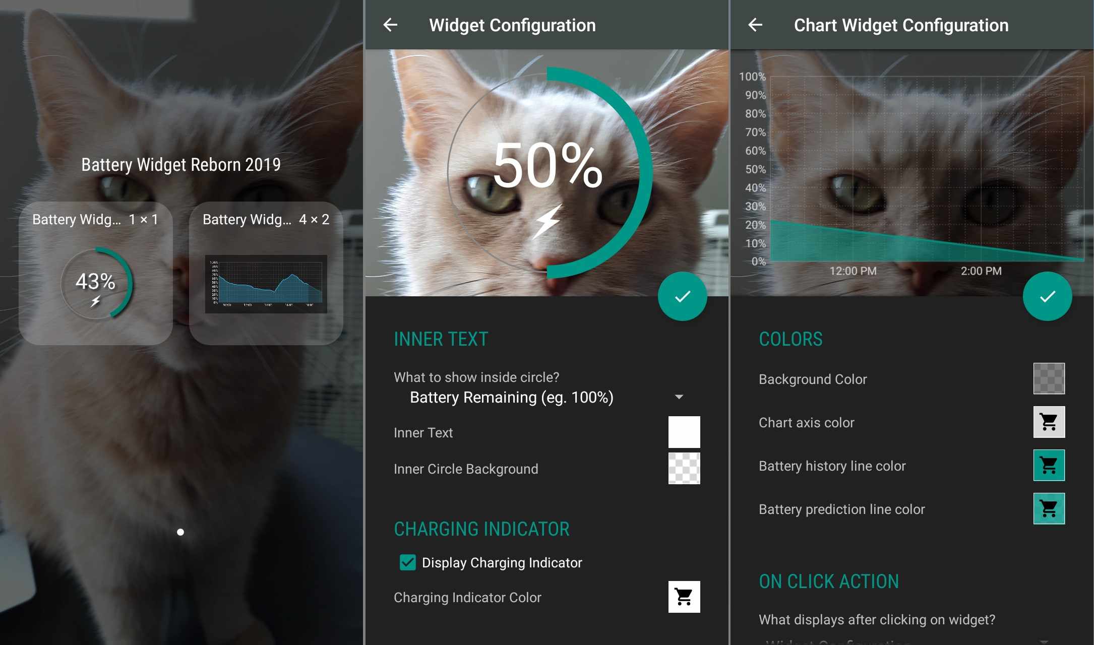
- Content Updates and User Interaction: Widgets must not display outdated information and should refresh promptly after user interactions or within the app itself. A manual refresh option is crucial for widgets with frequently updating data.
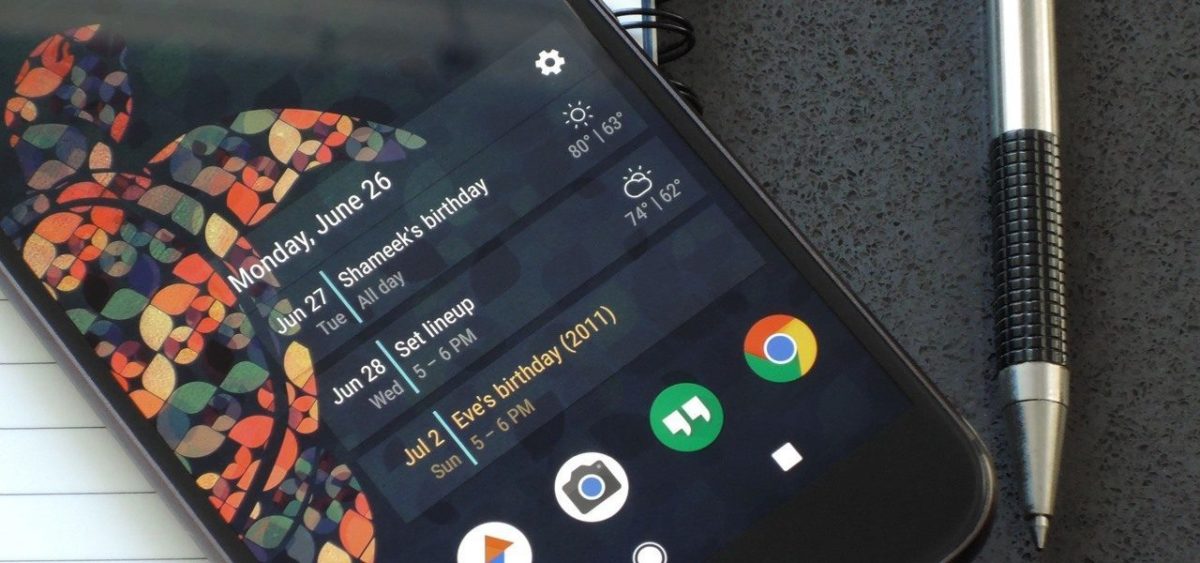
- Layout Excellence: A Tier 2 widget must extend across at least two opposing edges of the launcher grid, while a Tier 1 widget should span all four edges, ensuring a seamless edge-to-edge experience that maximizes screen real estate.
- Creative Flexibility in Design: Widgets aren’t confined to rectangular shapes; they can adopt custom shapes as long as they meet the grid-edge requirement, promoting creative design freedom.
- Color and Contrast: At a minimum, widgets should offer sufficient color contrast to ensure readability under various lighting conditions. Advanced theming, including light/dark modes and Dynamic Color, enhances visual appeal and user engagement.
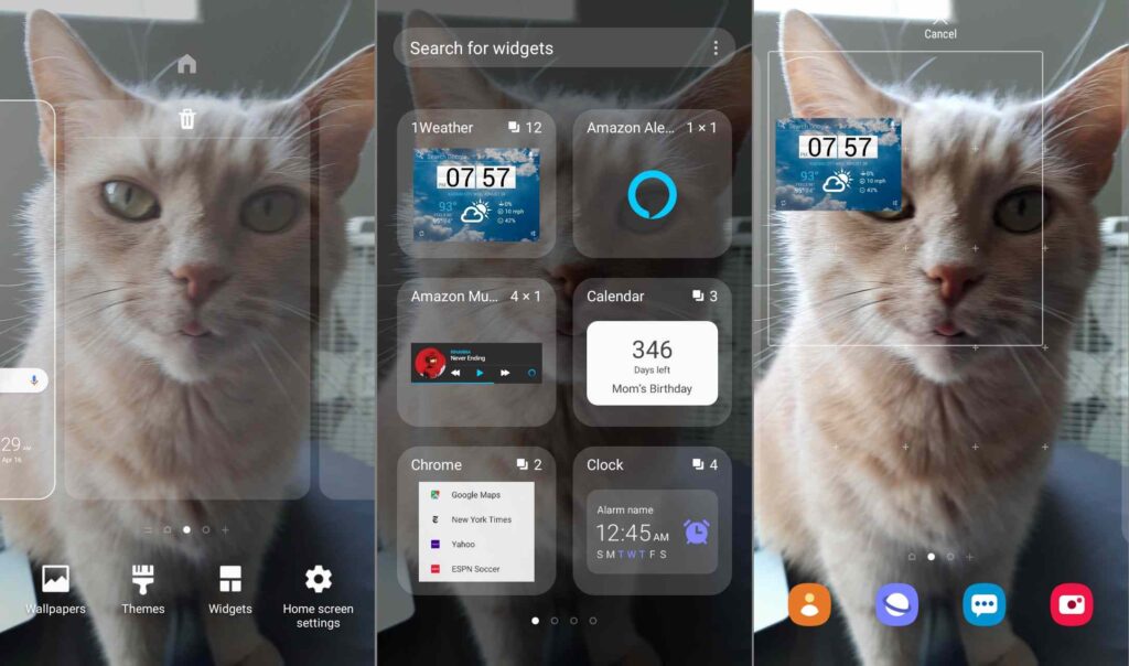
- Effective Discovery Mechanisms: Widgets should feature accurate previews in the widget picker to aid user selection, with added personalization for a more tailored approach.
- System Coherence: Widgets must integrate smoothly with the system’s design, including adopting the OEM-specific corner radius for rectangular widgets and providing smooth transitions and progress indicators.
The Future of Android Widgets
With these guidelines, Google not only aims to boost the functionality and aesthetics of widgets but also to ensure they contribute positively to the overall Android ecosystem. By encouraging developers to adhere to these high standards, Google is setting the stage for more intuitive, engaging, and useful widgets that will enhance the Android user experience.
As developers continue to innovate within these frameworks, Android users can look forward to a richer, more personalized interaction with their devices, proving once again that in the world of technology, the details really do matter.